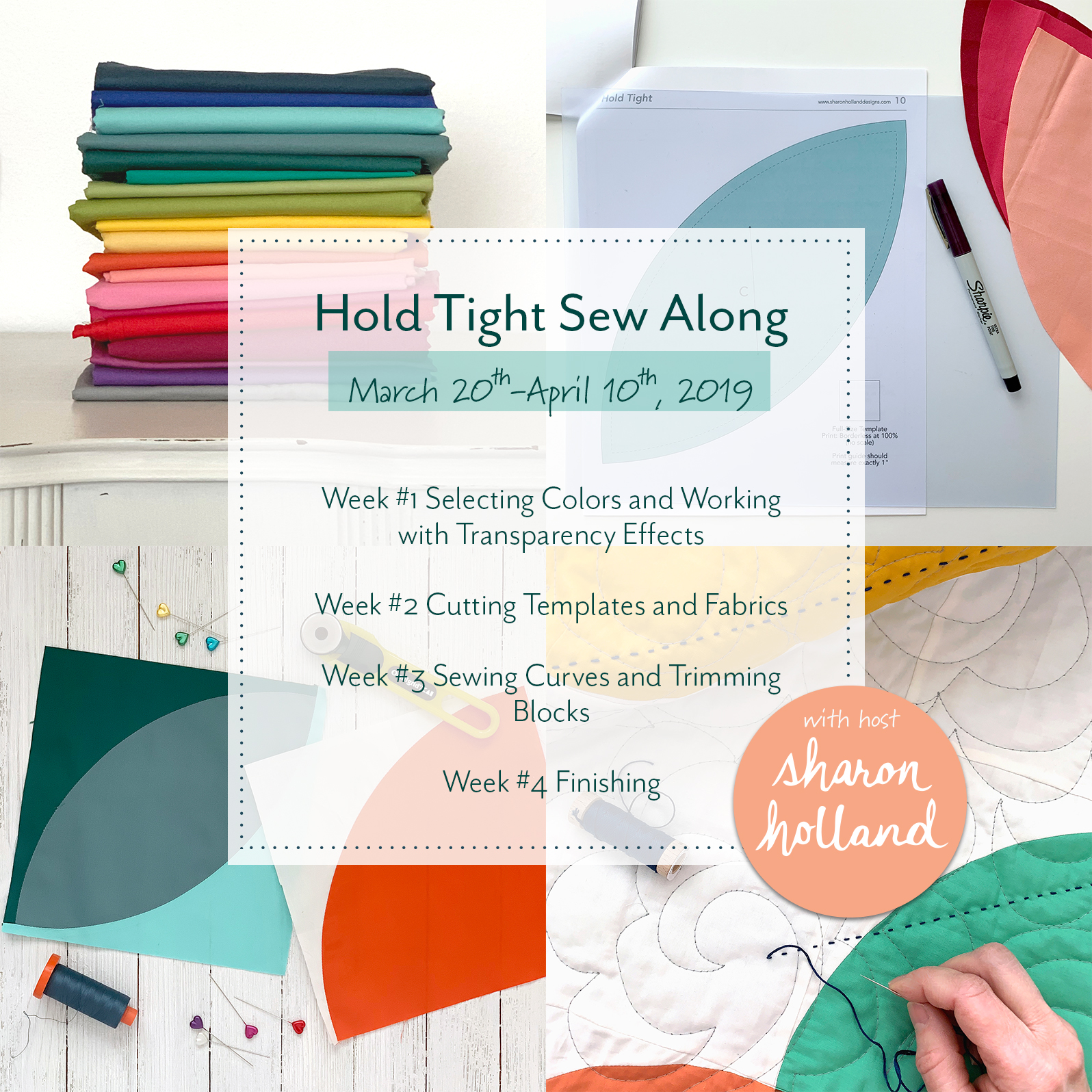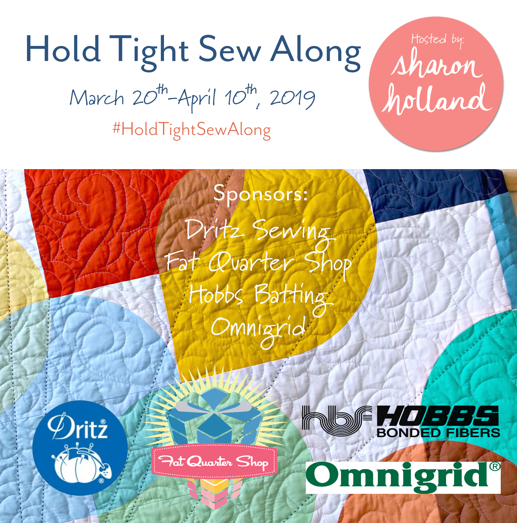
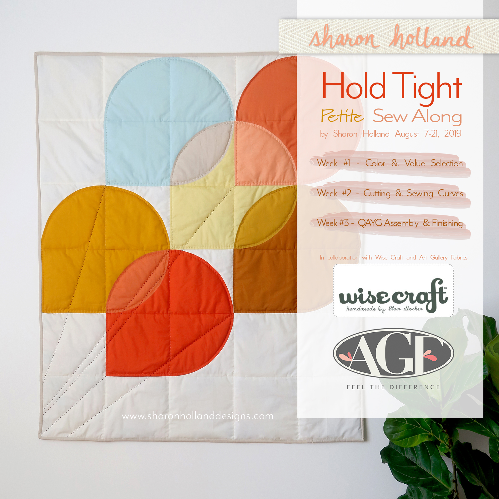
Hold Tight Petite Sew Along, Begins!
You’ve heard right, I’m hosting a sew along and it starts, today!
As part of Blair Stocker’s Wise Craft Ruby Ruler™ Ambassador series and being August’s Ruby Ambassador (Read my interview by Blair—here), I thought it would be a fun collaboration to merge my Hold Tight quilt and Blair’s ruby-viewer into a sew along workshop-like experience!

Hosting a new sew along is the perfect way to introduce you to Blair’s ruby-hued artist’s viewfinder tools the Ruby Ruler™ and Ruby Minder™ and to continue our exploration of selecting color and value for your quilts that we started in the first Hold Tight Sew Along. The extra bonus to this sew along is the opportunity to connect you to more than 1,500 other quilter’s via Blairs private Facebook group where Blair will have live workshop-like sessions to support my sew along blog posts. Note: Blair’s FB group is free to join by answering three questions when requesting to be added to the group. If you can’t join in the live sessions—no problem—the videos are available for replay and ready to view when you are!
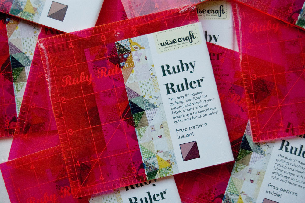
Wise Craft Ruby Ruler™
This sew along is also free to join—no sign up forms—just follow along and have fun. You’ll will need, however, my the Hold Tight pattern. If you don't have my Hold Tight quilt pattern already, you'll want to purchase the Hold Tight PDF pattern from my Shop page. The Hold Tight pattern now includes two sizes—the original over-sized throw and the new petite crib-size quilt. The material lists, cutting requirements, coloring sheet, and full-size templates are part of the fully illustrated PDF pattern. These sew along blog posts serve to supplement the PDF but don't provide the detailed pattern information that you'll find in the PDF available for purchase. If you’ve purchased the original PDF prior to August 5, 2019 and didn’t receive a special newsletter email from this blog sharing the link to the Petite Add-On download, see my SEW ALONG page to get your copy of the bonus size. You’ll find the Add-On download that contains the crib-size material list, cutting guide, and coloring sheet. Note: You’ll still need the original Hold Tight pattern for quilt details. The current PDF in my shop has been updated with both quilt sizes so patterns purchased after August 5, 2019 include both quilt sizes—no add-on necessary.

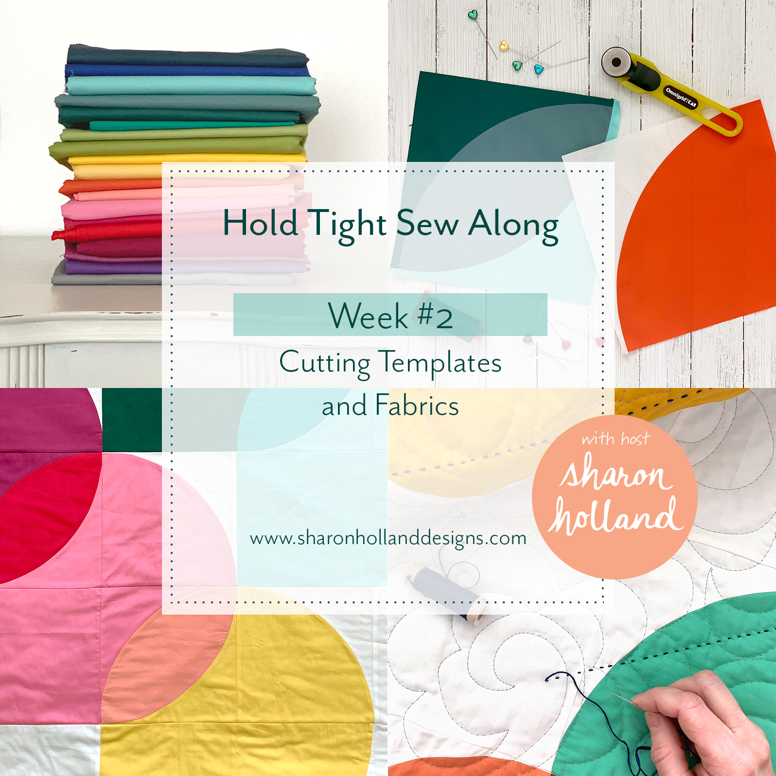
Week #1 - Color and Value
Welcome to Week #1 of the Hold Tight Petite Sew Along! For this blog post and the following two posts, I'll share tips and tutorials to bring your quilting skills to a new level. In three weeks you’ll no longer be hesitant about working with color and become confident about stitching a quilt with curves!
From now until August 21, 2019 I'll break down the key components of the Hold Tight quilt pattern into three manageable tutorial blog posts. These tutorials will be useful to anyone working with fabric and patchwork regardless what quilt you’re stitching. In addition to my written posts, I’ve adding skill-building demonstration videos from the first Hold Tight sew along. Find these helpful videos on my Sew Along page and can be accessed at any time. Plus, for this Hold Tight Petite sew along, Blair Stocker will be following up my Wednesday morning blog posts with a Facebook Live session at 3:30pm PDT covering the same topic that same afternoon!

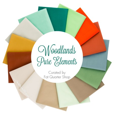
For this sew along I’ve designed a 6-balloon Hold Tight quilt using Art Gallery Fabrics Pure Solids. This crib-perfect size is not only quicker to make than the original quilt because there’s fewer blocks but also has a manageable number of colors needed to achieve the balloon shapes and transparency effects between balloons. Either size you choose to make the principles of color selection and construction are the same.
Where to Begin When Choosing Colors
The Ruby Ruler™ and Ruby Minder™ rulers are perfect for helping to see values between colors by reducing hues to gray scale—allowing you to see value changes. But what does it mean when I say, value?
Value is the darkness or lightness of a color (hue). A high value change between colors can also be called contrast. Black and white have high contrast. A low value change between colors can be called tonal, making the changes (or steps) between the colors subtle and less noticeable.
Let’s assume you’re NOT working with a kit or fabric collection that a designer has already determined the color story. Most of you will be working from your stash of solids and/or purchasing fabrics for your Hold Tight quilt. Where do you begin in selecting colors and how do you get the transparency effect?
The answer is to think like a designer and artist. So as not to overlap too much on the great information I’ve already covered on Week #1 and Week #2 of the original Hold Tight sew along, I’ll cover aspects of color and value as I use them in my surface pattern design, artwork, and quilts. Be sure to take a look at those earlier posts if you’re wanting more insights into Color.
My Process
I’ve introduced you to the trick of using inspiration images for color selection on the Community Sampler Week #1 post and like I said, on Week #2 Hold Tight Sew Along. I used this same approach when selecting the colors for my fabric collections and my finished Hold Tight Petite quilt. Now, let me walk you through the process….
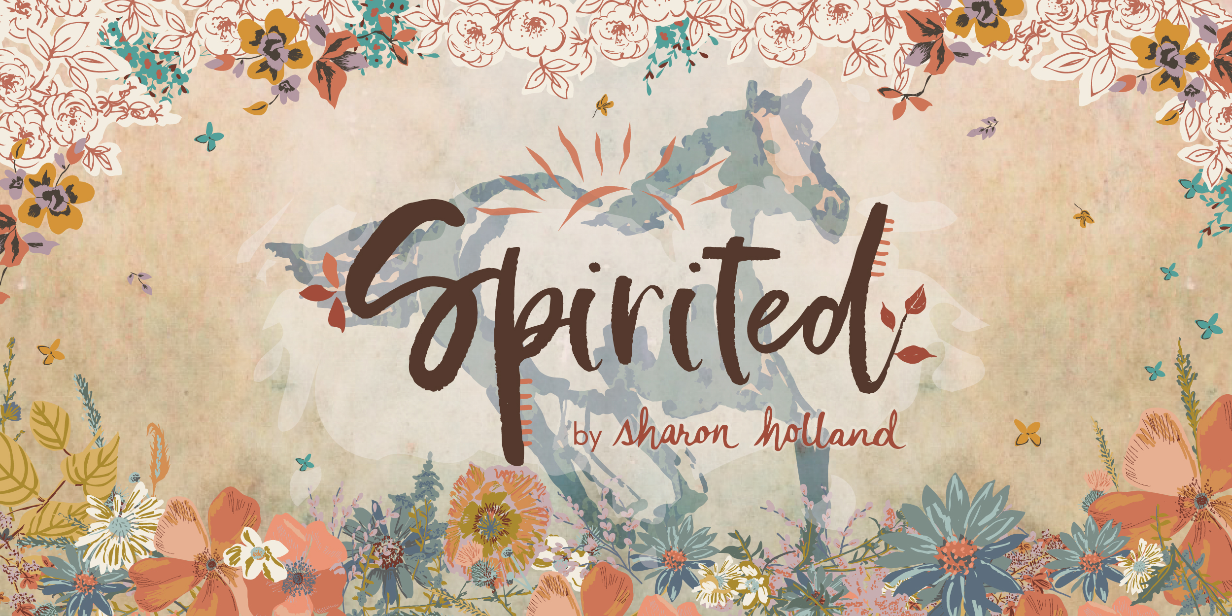
Spirited by Sharon Holland
My next Art Gallery Fabrics fabric collection Spirited comes out November 2019. Before I even begin designing prints I consider the season the fabric collection will be released—in this case fall. Then I think about the mood of the collection or what sort of story I want to tell—this very much influences color, values, and of course print designs. When you’re selecting fabrics for a quilt you may subconsciously be asking these same sort of questions: What room will I be using this in, who is this quilt for and do they have favorite colors, what story or mood, energy, or feeling should this quilt have.
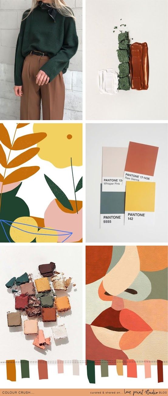
After I have my brief or concept from those initial questions, I then go to my iPad and start poking around on Pinterest. I start a private folder to gather my ideas and allow myself to go down that rabbit hole. For your assignment, I want you to do the same thing but try not to think literally (like in this case, balloons) —just explore a wide range of images. You’re bound to have a couple beautiful images jump out at you that check off all the boxes in those initial questions. You’re golden when you can find one or two—that’s all you need—that sum up your vision in that image. Here’s the four Pinterest-pulled images that were the color and storyline inspiration for Spirited. You can view all the prints from the collection, here.

Storyboard images pulled from Pinterest
I used this exact same concept to develop the palette for my Hold Tight Petite quilt and I’ll go further into exactly how I extracted the colors from my inspiration images for my collection and for my quilt.

Inspiration images pulled from Pinterest
Because I’m heavily influenced by my upcoming fabric collection and craving fall colors (my favorite season) I found myself wanting earthy hues and an ethereal, muted palette and had that as part of my brief. Nature has always been an inspiration for me in my art so I started a search on butterflies and found these two images that I thought would make a nice color story. It’s a rather limited palette of chartreuse, gold, burnt orange, rust, cornflower blue, and lavender. I could’ve easily extracted the green in these images but instead decided not to introduce that color into the analogous/complimentary scheme that was happening already.
An analogous palette is one where shades (black added), tints (white added), tones (gray added) of hues (colors) lie next to each other on the color wheel. Complimentary colors are two hues directly opposite each other on the color wheel and include the shade, tint, or tone of those hues.
Knowing that the 6-balloon quilt has spots for four transparencies I was conscious to select colors that if mixed could yield plausible transparency colors. See Hold Tight Sew Along Week #1 post from the first sew along—it talks all about color mixing.
Extracting Colors
I’m fortunate to have a lot of design tools in my bag of tricks and I use Illustrator or Photoshop to extract colors from images. I don’t have any specific suggestions but I’m certain there’s many wonderful apps available that you can do on your phone and get the same sort of results—just do some looking around.
I import my images into my program and use the eye-dropper tool to extract a color I like from the image. Of course one could go crazy pulling colors so I limited my pull to eight on my initial pull—knowing my background was going to be off-white, I didn’t need to include that in my selection.
What I was aiming for in my initial eye-dropper extractions was a pleasing range of colors of similar value (darkness or lightness) to maintain my idea of etheral but yet, if I were to line up those selected colors from darkest to lightest there would be a noticeable change in value steps. In my fabric design, artwork, and quilting I try to have one or two value steps between colors that will be touching so they can stand out from each other. You can see that in my above example the colors almost step dark, light, dark, light….
Remember, my background is going to be off-white which in my quilt will be the lightest value. Any of the colors from my initial pull will have enough contrast next to the off-white fabric. So, if your quilt has a medium value background you will want to be pulling a lot of light and dark fabrics for the balloons.
From that initial pull I (with the use of my Adobe program) I then let the computer select the nearest Art Gallery Fabrics Pure Solid color (that I’d preloaded into my program). You can see the results of what the computer selected as the nearest equivalent. As for my textile designs I have all the Pantone colors preloaded into my program and do this exact same process on my first pass to creating a color story for a collection.
But what if you don’t have access to computer programs or apps? Go old-school and manually compare your fabric swatches. Here’s some ideas:
Print out inspiration photos
Take your own photos that could yield an interesting color story
Use watercolors or paints
Pull physical items from around your house that have colors you love
Use a painting or colorful printed fabric
Take a walk in a garden or museum
Getting Real
Now it’s time to get off the computer and start pulling fabrics in real life. I took my initial Pure Solids results to my sewing room and spread out my stash of Pure Solids to compare the print out to actual fabric. Here’s where your design instincts, the Ruby Ruler™, and your personal preference will go to work.

The Goldilocks Syndrom
The first photo is the fabric pull based on the initial computer generated AGF Pure Solids selection with two exceptions: The removal of PE-421 because it was too close in value to another fabric and PE-460 because it was too dark compared to the rest of the pull or too high of a contrast. I exchanged those fabrics with PE-485 and PE-457 and that’s what you’re viewing in this first photo. Colors don’t always translate perfectly from screen to reality, so it good to see them in person. I also wasn’t feeling the lavender (although its a gorgeous color and I so wanted it to work!). Viewing the lavender with the Ruby Minder™ I could see it was too bright or a pure a color (one without as much gray added) and not muted enough to play well with the vision for my color story. It threw a bit of a cog into my color wheel (ha ha).
The second image shows that I’ve replaced the lavender with a mid-tone gray but when viewing the new selection through my Ruby Minder™ the gray and the blue were too close in value—making it ineffective as a transparency choice.
For the third photo I selected PE-432, a lighter gray with a hint of yellow undertones so it related to the honeydew yellow. This color selection actually made more sense as a transparency color between the blue and the light yellow even though in reality mixing those two colors would produce a green—I wasn't going to bring green into my palette so this was my best neutral that would convincingly work as a transparency. A quick confirm with my Ruby Minder™ and it was just right!

I cut out all my pieces and put them up on my design wall to double-check my selections before starting to sew. It’s hard to see the off-white background pieces against my white design wall, but they’re there. I used my Ruby Minder™ again to negate color and view my pieces in gray scale to see if the transparencies and balance was cohesive. That’s when I did just a bit more tweaking to color placement from my original plan and added in a ninth balloon color of PE-484 for a smoother transparency between the lightest yellow balloon and the dark gold balloon.

Here’s my final fabric pull for my Hold Tight Petite quilt and I’m super happy with how it looks and relates back to my inspiration photos and brief for this quilt. I’m excited to see what Blair selects for her quilt and would love to see your inspiration for your color story and fabric pull, too! If you’re on Instagram, tag me @sharonhollanddesigns and Blair @blairs use the #holdtightquilt hashtag so we can follow your progress. If you’re sewing with Art Gallery Fabrics be sure to tag #artgalleryfabrics too! Don’t forget that you can join Blair’s Facebook group and meet others working on this quilt along with value and color insights from Blair’s expert knowledge of the subject.
Blair also has a wonderful online class, Make Modern Scrap Quilts Using Color Value which is an evergreen class—you buy its and it’s yours forever, there are no "sessions". Read more about this class on Wise Craft Handmade.
Looking Ahead

This first week has been all about color and value and making your fabric selections for the size quilt chosen. If you’d like to work ahead and begin cutting out your materials you can reference the Cutting Templates and Fabrics video from the first sew along as well as the additional tutorial information found on the corresponding blog post from the first sew along.
Otherwise on week two I’ll blog about Cutting & Sewing Curves and Blair will being cutting and piecing live on Facebook. We’ll also have a fabulous giveaway from myself and Art Gallery Fabrics of a Hold Tight Petite Quilt Kit consisting of the pattern and the exact Pure Solid colors I used in my Hold Tight Petite quilt along with your choice of any AGF print for the backing! More details on that giveaway next week. Note to anyone winning a Hold Tight quilt pattern on this SAL that’s already purchased the pattern—we can substitute with your choice of a different PDF pattern from my SHOP.
Looking to week 3… I’ll be covering how to finish your quilt in a Quilt-As-You-Go method (QAYG) and talking about the hand quilting I did on my sample. If you’re interested in QAYG —don’t sew all your blocks together if working ahead! We’ll need the blocks as (horizontal) rows for securing to the batting and backing. More about that on the final week.

Hold Tight Petite Quilt-As-You-Go quilt assembly peek
Week #1 Giveaway

Right now, over on Instagram, Blair and I are holding the first giveaway. Visit my IG feed @sharonhollanddesigns and enter to win a Hold Tight quilt pattern and Ruby Minder™ ruler for yourself and a tagged friend! Follow the giveaway rules on the post. Look for the post giveaway image on my feed just like the one above and enter by commenting. Two pairs of friends will be randomly drawn from the comments on around 4 pm Eastern Friday, August 9, 2019 and notified on Instagram.
Both giveaways for this tour will be held on my Instagram account @sharonhollanddesigns. Be sure you’re following myself and Blair @blairs and Art Gallery Fabrics @artgalleryfabrics so you don’t miss a thing!