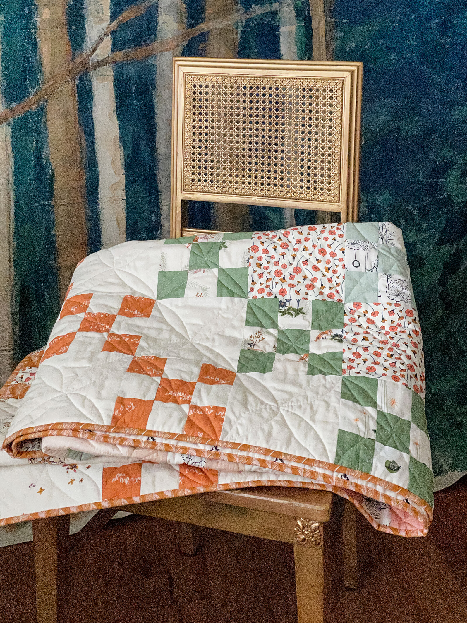
Charming Nine
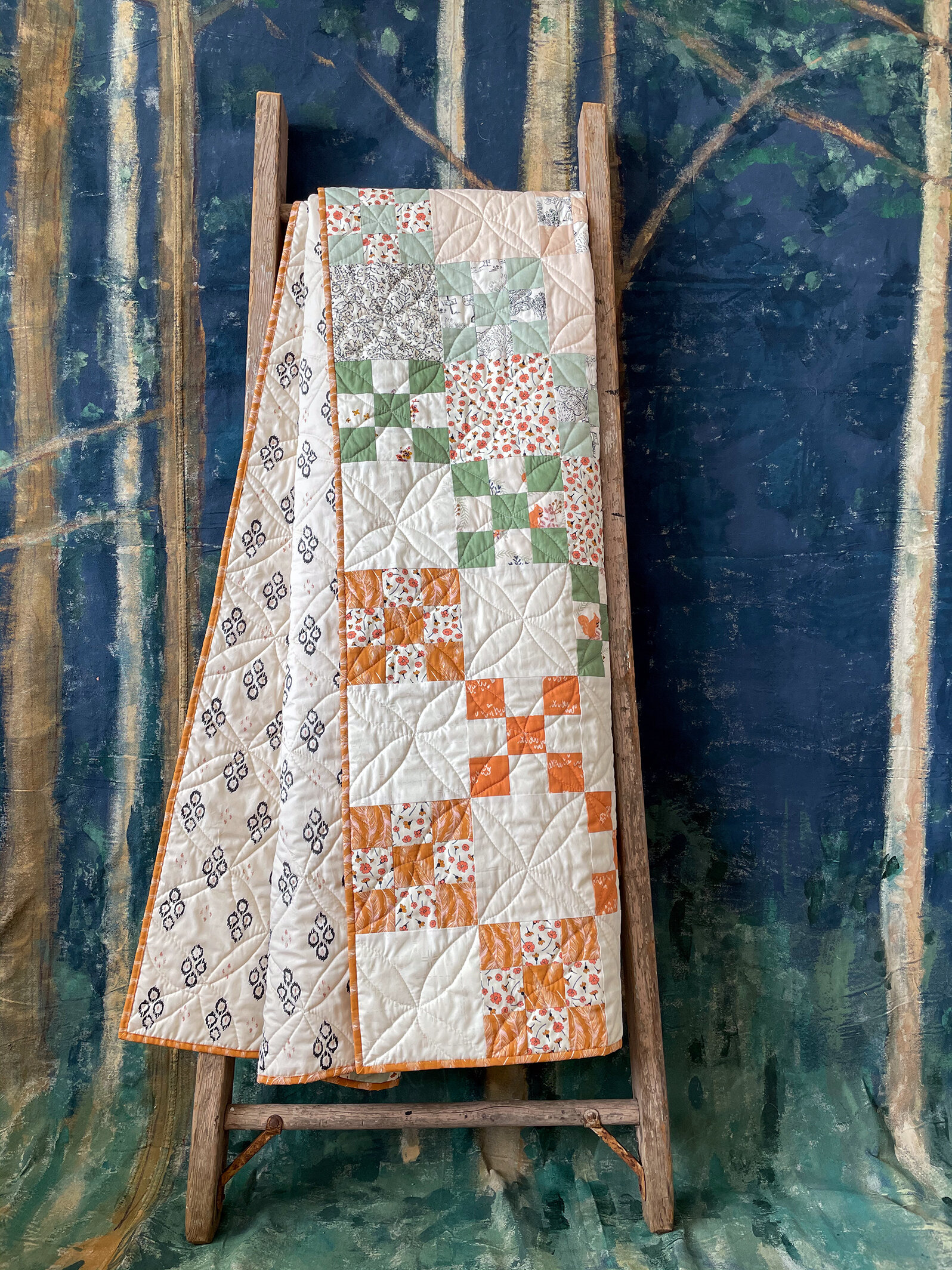
Charming Nine quilt designed by Maureen Cracknell and stitched by Sharon Holland
Scrap quilts and Nine Patch blocks hold a special place in my heart. Collecting fabrics and making quilts from a stash is the core reason for me making quilts in the first place and what started my love affair with prints, calicos, and becoming a surface pattern designer.
The Nine Patch quilt block is especially meaningful to me because it was the second quilt I’d ever made and the first quilt I hand quilted. The first ‘quilt’ was actually a Nine Patch variation with sashing and tied, so technically it doesn’t count as a quilt because of the way it was finished.
To see my first quilt of a red and white Single Irish Chain quilt on my @sharonhollanddesigns Instagram post swipe through to the second slide to see a fun stop motion video.
Last week Maureen Cracknell posted images on her Instagram account of a Nine Patch quilt she was making that used 34 different fabrics from combining her 16 piece Art Gallery Fabrics Homebody collection with my 16 piece Kismet collection and 2 prints from Bonnie Christine’s Lambkin collection.
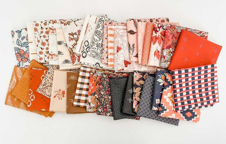
AGF Nine Patch bundle and photo courtesy of Lady Belle Fabric
I instantly fell in love with Maureen’s quilt and had to make one, too! Because I had written the free pattern for my Charming One quilt last fall, I thought it would be fun to continue the beginner-friendly series of easy quilts and dubbed this quilt pattern Charming Nine because of it’s inherent scrappy nature. Find both the patterns on my Free Projects page.
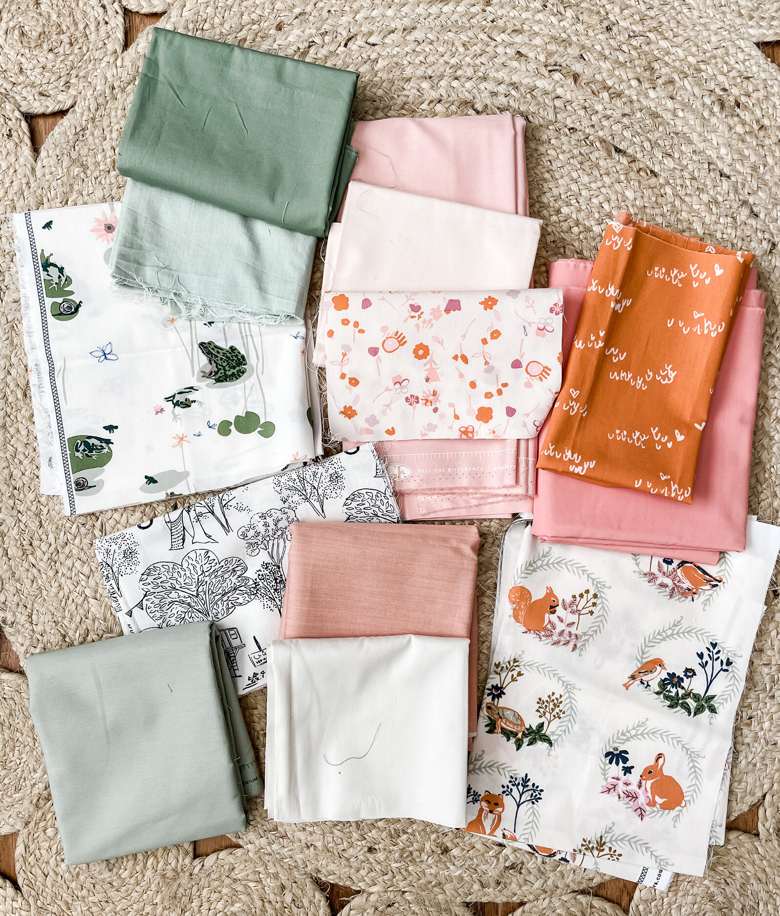
This fabric pull is a partial look at the fabrics that went into my Nine Patch version. I had just a few scraps of my upcoming Lilliput collection left and because they were light prints I decided to keep the lights and darks of the Nine Patches in the same place on each block, opposed to Maureen’s quilt that she mixed up the light and dark positions in the blocks.
By my using the light prints in the 4-patch positions on the Nine patch I could conserve my little bit of fabric and use the 5-patch darker fabrics in solids and blenders that I had more materials of. I ended up supplementing this pull with Homebody, Kismet, Spirited, Pure Solids, Decostitch, and AGF denim to get enough for my scrap quilt. I also kept the background squares of my quilt light to create a Single Irish Chain affect with the diagonal dark squares as a nod to my first quilt make.

I’m calling my quilt a Controlled Scrappy quilt because even though I used 16 different fabrics there’s an order to the light and dark placement to create an obvious pattern to the quilt design.
You will want visit Maureen’s blog to read about her quilt and see her beautiful photos. I like to think of our two versions as sister quilts, Town and Country quilts, or Controlled Scrappy and Super Scrappy quilts but however you name them they’re uniquely beautiful and so much fun to make!
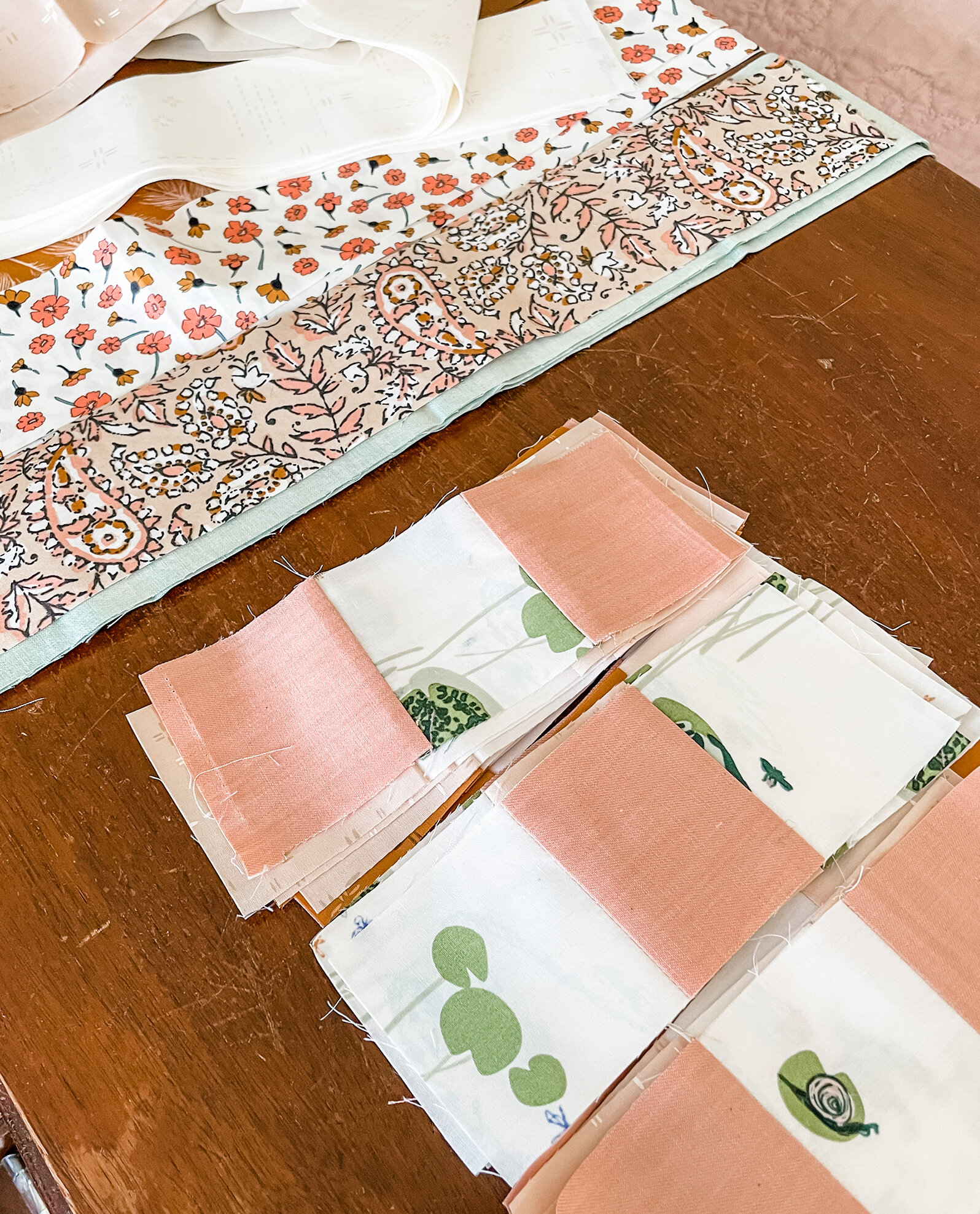
Like I mentioned earlier, this scrap quilt pattern is fat quarter friendly and written using Strip Sets rather than cutting a bunch of squares. You can use as many or few of prints as you like and in whatever way to reach the total yardage required (see PDF pattern). I used a mix of scraps, fat quarters and width of fabric cuts to get the number of blocks needed. Jelly Roll strips will also be great to use on this project.
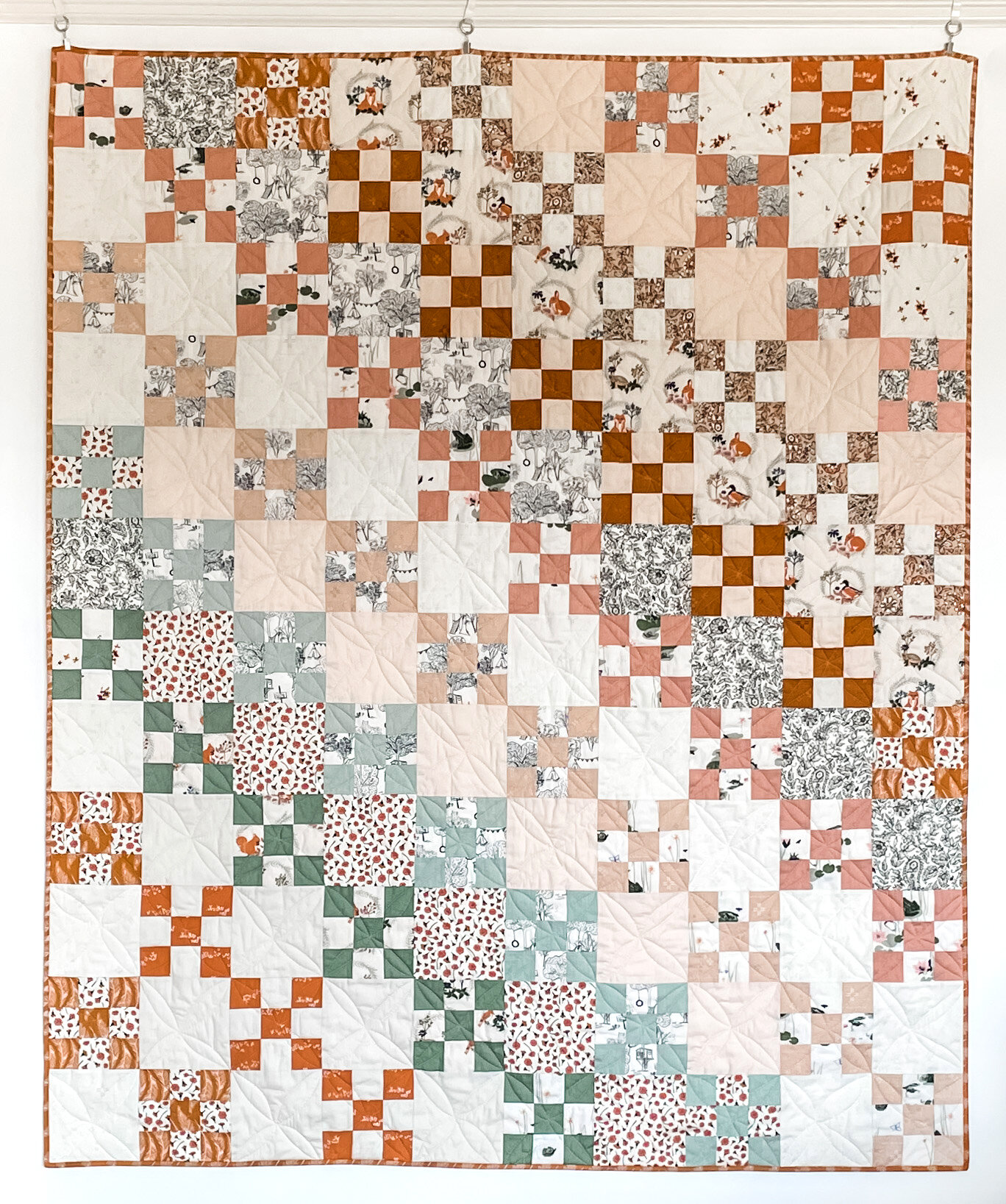
I could’ve evenly distributed the Nine Patch blocks across my top like Maureen had done but to accentuate the difference between our versions and keep more control over the look of my quilt I placed the Nine Patch blocks in diagonal lines by color or close enough color if I ran out of fabric for an exact match.
With the low volume spring-inspired palette and playful nature-based prints I was smitten by the cottage-style of my quilt and wanted to play off the vintage feeling to it’s fullest. So, to give some added texture and comfort to the quilt I used two layers of Hobbs Tuscany Silk batting! Doubling up the batting makes the quilt heavier and stiffer but has an incredible, vintage heft and feel! The machine quilt has lovely definition and the binding edge is thick and wonderful.

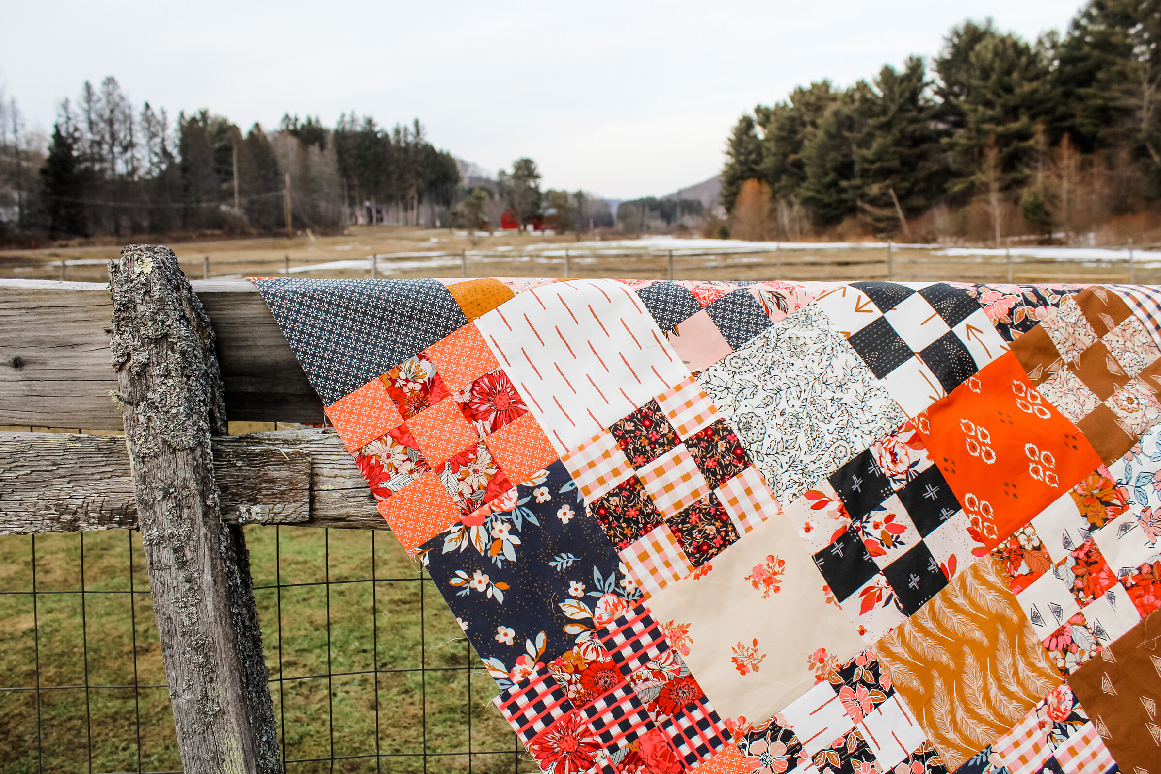
This quilt needed to be made and finished quickly because there was also a pattern to be written and photographs to be taken before posting a week later. I started cutting pieces on a Thursday and by following Tuesday morning put the last hand stitches in to the binding. I didn’t have time to send this quilt out to be professionally long arm quilted so I did the free motion quilting myself. Yes, it’s irregular and very organic (a pleasant word for wonky) but I’m very happy with the results and it fits the true utility scrap quilt tradition.
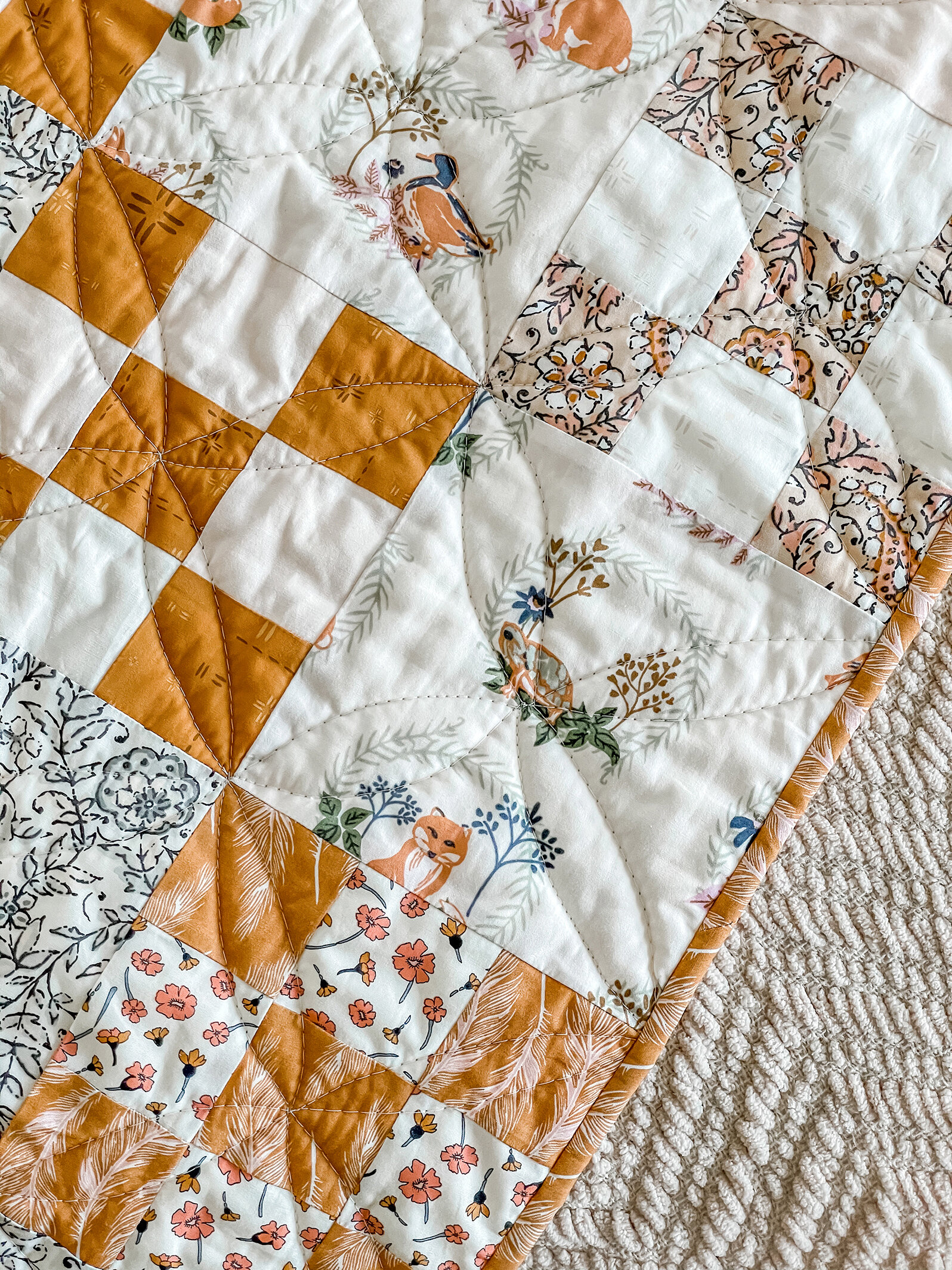
At first I was tempted to do diagonal straight line quilting but thought that would be pretty boring and maybe I could do something just a little better than that. I ended up with this not-so-perfect Orange Peel design that I will share with you just how easy it is to do—without even marking your quilt or using templates or rulers!

Orange Peel Quilting
Working on the diagonal, and eye-balling down the center of the blocks, start needle at the corner of a block and stitch an arching half circle or shallow curve that returns to the center of the block. Repeat that same arching curve, ending at the opposite corner of the block. Continue repeating the two arching curves on each block until you reach the end of the diagonal block row.
Turn the quilt around and repeat Step 1, arching the curves to reflect the curves made on the first pass down the quilt.
Repeat Steps 1 and 2 creating parallel diagonal arching stitches down and back up each Nine Patch and Square diagonal rows creating loops as show in illustration 3.
Repeat Steps 1 through 3 in the diagonally opposite direction to create Orange Peel quilting. Note that the quilting on my quilt has shallow loops compared to the nice computer generated example. If you’d like your quilting design to be more regular and closer to perfect, you may want to mark the top first or use a curved ruler when stitching.

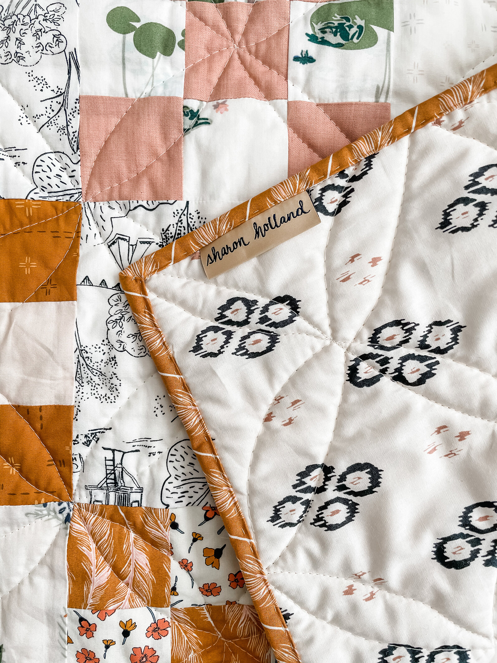
For the backing of my quilt I used Ikat Diamond Posh from my Art Gallery Fabrics Kismet collection. My labels are made by the Dutch Label Shop and I hand stitched the binding with a running stitch for a little extra special touch.
I hope you make yourself a Charming Nine quilt and get your quilt friend involved too. You could have a Nine Patch block exchange or a virtual Sew In—a good excuse to play with fabrics and sew!

Fabric carrots by Sharon Holland
While we’re talking about scraps, I wanted to share a fast and fun project I had posted on my Instagram account—Fabric Carrots. This was inspired by burlap carrots I saw at Target and thought, “Heck, I could make those and there’s some prints in my Lilliput collection that would make the cutest carrots!”
The project is so easy I felt it didn’t need any more than a silent stop motion video to explain how to make them. You can use scraps, make them any size or length you’d like, and there’s only two seams to sew! I took my carrots and made a door decoration from hanging them with raffia. Use the link and slide through the photo like the one shown above to see the tutorial video HERE. See the door decoration post HERE.

If you’ve been wondering about this Lilliput collection I’ve been talking about in this post and the few prints you’ve seen used in my Charming Nine quilt, I’m talking about the next fabric line I designed. Lilliput is my first ever children’s collection but it’s not just for kids and has prints the whole family will love. Take a look at the collection on the AGF website, HERE.
Lilliput is my 10th collection for Art Gallery Fabrics and is slightly delayed because of all the shipping hassles happening world wide but due in any day and it wont be long before this collection starts showing up in your local quilt shop and favorite on line shops!
I’ve started a stock list for online shops carrying Lilliput and you’ll find link on my Fabrics page. Some of these shops are taking pre-orders for the collection to if you’re one who likes to have collections as they first come out and before shops sell out you’ll want to get your name on the list!
Trust me, there’ll be much more to share about Lilliput and new quilt patterns in the weeks ahead. Until then, happy sewing!
I am an Amazon Associate site and earn from qualifying purchases on the products I’ve linked below. The helpful products selected are the same or similar to materials used to make the project(s) in this blog post or related items I think you may enjoy.