Happy New Year - 2019
My last post was the end of November 2018 so I need to fill you in on what’s happened between then and now. December went by so fast I didn’t even get a chance to make an appearance on this space-my apologies.

Holly Spring by Sharon Holland
My December revolved around friends and family and I just didn’t bother with keeping up my social spaces during that family time. I had a wonderful Thanksgiving through Christmas and I hope you did as well.
If you follow me on Instagram you saw that I had painted similar sprigs of holly art for sale and then painted larger pieces as gifts. I was very pleased with the response to my art and am very encouraged to continue painting and eventually selling prints and originals in the future. Thanks to everyone who purchased my art!

Holly by Sharon Holland
Right after Christmas and up until writing this post I’ve managed to find extra time to paint. I’ve been exploring acrylics and revisiting watercolors when painting these following pieces.

October Bouquet by Sharon Holland

Daisies by Sharon Holland

Floral Wreath - yellows - Sharon Holland

Floral Wreath - reds - Sharon Holland
Exploring with different mediums and styles is a good way for me to reacquaint myself with painting. The more I create, the more my style as an artist will emerge. I feel I need to make a larger body of work before I decide which paintings to turn into prints and what sort of products to offer (note cards, posters, fabric, original art, etc).
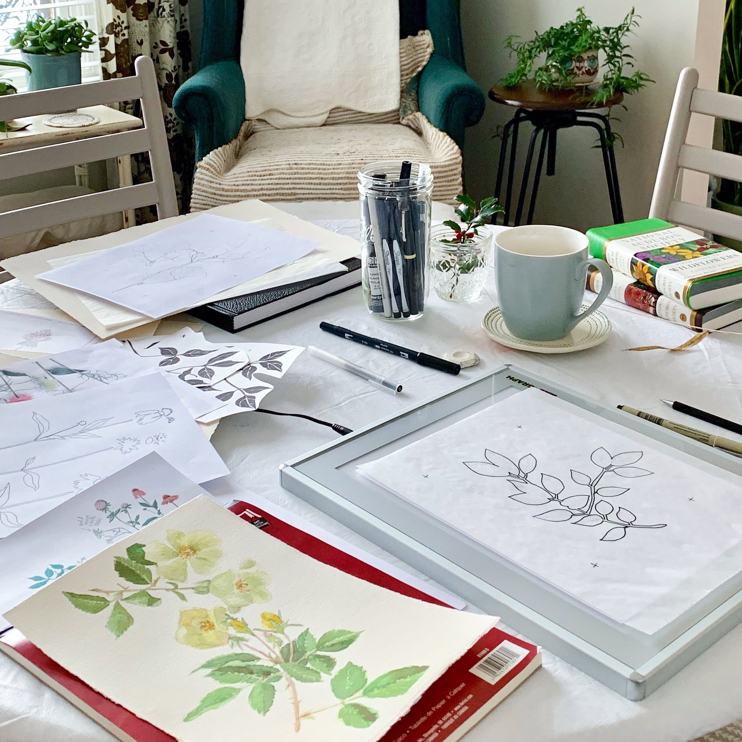
In the world of design there’s a lot of hurry up and waiting going on behind the scenes. It’s not always easy to have things to share because release dates are set way into the future. Very soon spring fabric collections will be revealed and this week I’m putting the finishing touches on a short intro video for my next Art Gallery Fabrics line. The photo above shows my office workspace littered with ideas for a fall collection that I’m currently working on and the photo below is a still shot from my promo video.

Sharon Holland - Designer
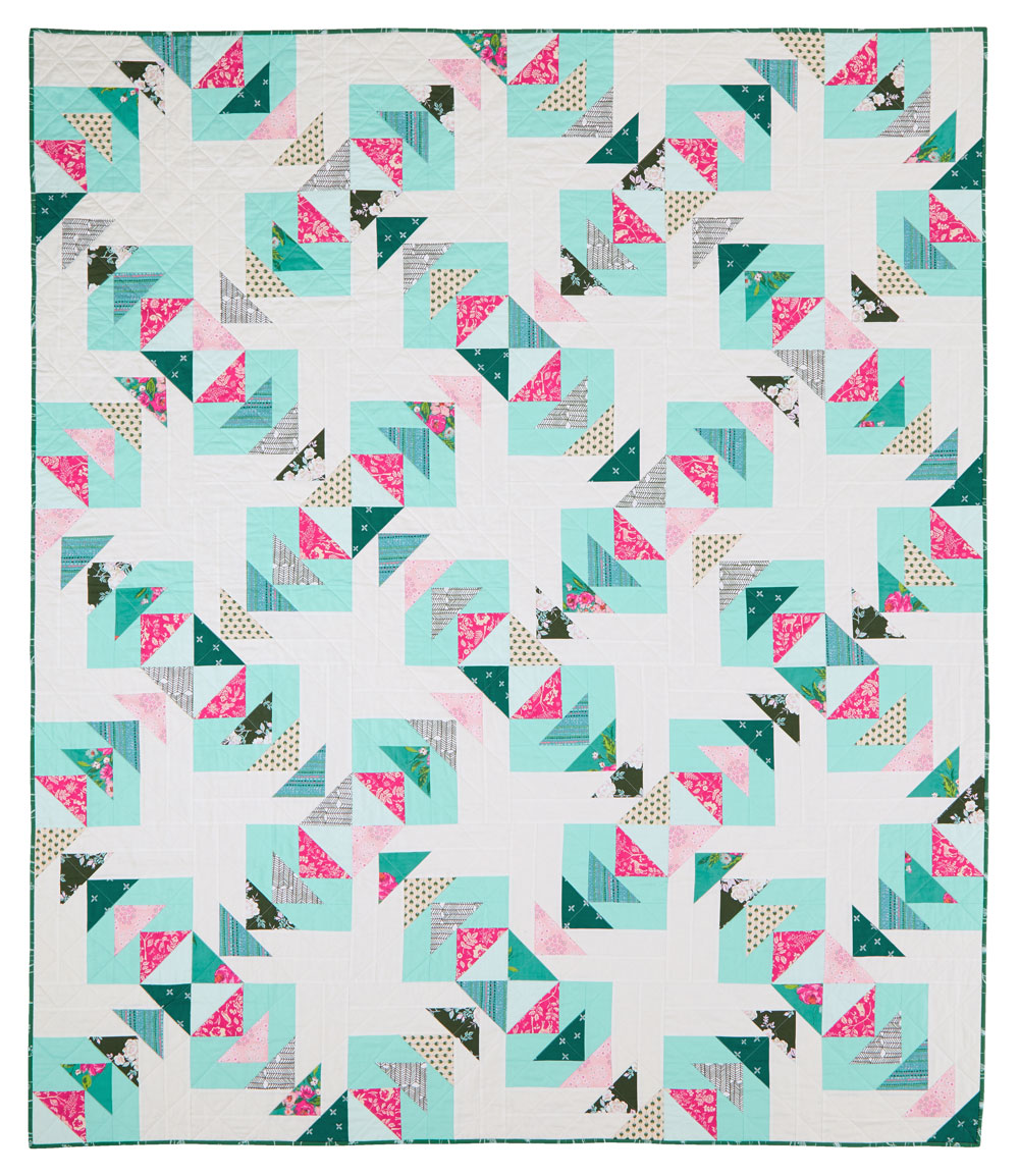
Case in point is my quilt featured in Quilts & More magazine. I made this quilt last spring and sent it off to my friends at All People quilt as soon as it was finished. Because a magazine need to work so far in advance, it was not going to show up in print until the Spring 2019 issue—that’s a long time to wait to be able to show you my quilt! Good thing I had plenty to keep me busy with until now because I really hate wating!

Sense of Direction by Sharon Holland. Used with permission from Quilts & More™ magazine. ©2019 Meredith Corporation. All rights reserved.
This fun quilt is made using fabrics from my Signature collection for Art Gallery Fabrics and AGF Pure Elements solids. Great for even a beginner, this full-size quilt is a quick to piece and with it’s simple, diagonal quilting it’s also quick to finish.
Sense of Direction by Sharon Holland. Used with permission from Quilts & More™ magazine. ©2019 Meredith Corporation. All rights reserved.
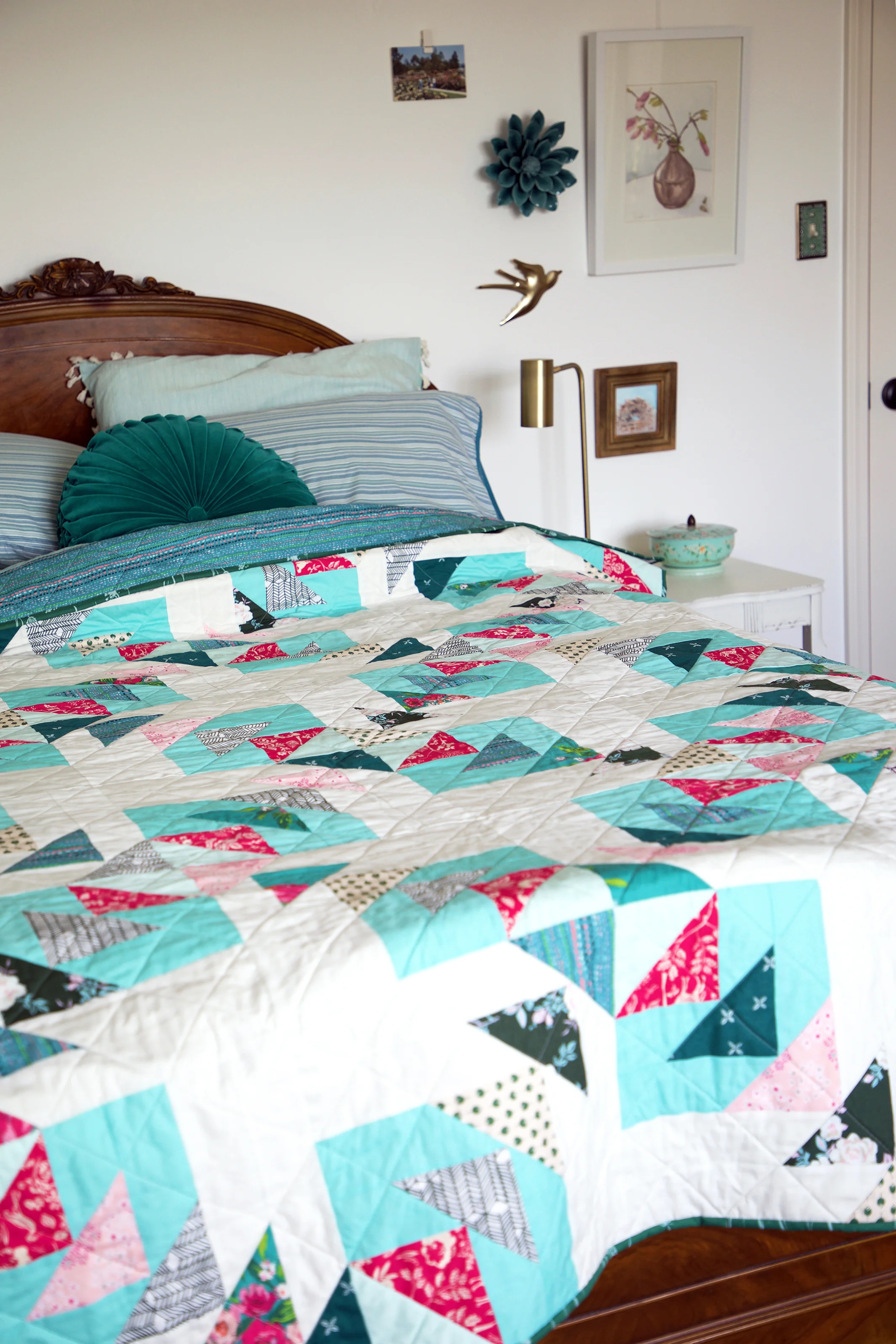
Sense of Direction by Sharon Holland
Look for the Spring Quilts & More magazine on newsstands beginning January 11th.

Quilts & More Spring 2019. Used with permission from Quilts & More™ magazine. ©2019 Meredith Corporation. All rights reserved.
What a bright and beautiful way to start out the first post of the new year with all these flowers and colorful quilts and projects!
Looking ahead, I know many of you are wondering if Maureen Cracknell and I are planning a new sew along for this year…well, remember that hurry up and wait aspect of designing? After much deliberation we both decided we’ll be skipping this year. Preparing a sew along takes months of advance work which both Maureen and I don’t have at our disposal right now. Speaking for myself I have personal and artistic growth reasons why I need to step away from a sew along this year.
Over the last two years and three sew alongs we’ve prepared you for patchwork success and pushed you to push yourself as an artist. When we start our next sampler (hopefully in early 2020) you’ll be ready to take on bigger challenges right along side us.
You can expect to see new fabric lines from both Maureen and myself, blog tour appearances, and with various “irons in the fire” you won’t be without new inspiration, new sewing projects, and fabrics to add to your stash throughout the year. We hope you’ll continue to stop by our blogs and other social platforms to say “hi” and see what we’re up to.
Cheers to a new year and all it has to offer!