
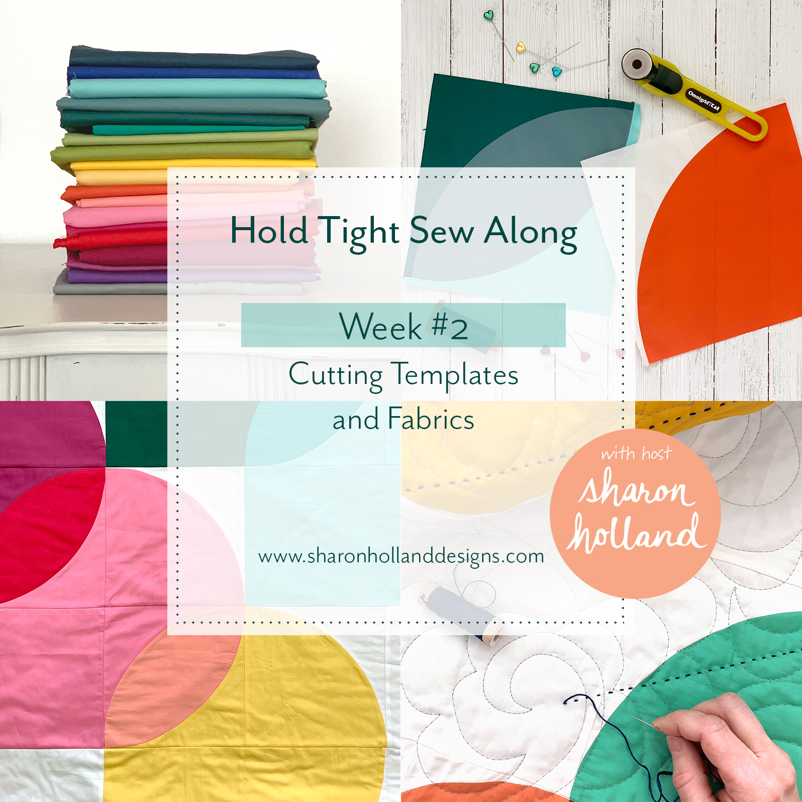
Hold Tight Sew Along Week #2
Welcome to Week #2 of the Hold Tight Sew Along! For this blog post, and the following two posts, I'll be share tips and tutorials to bring your quilting skills to a new level. No longer will curved piecing hold you back from stitching a quilt with curves!
If you don't have the pattern already, you'll want to purchase the Hold Tight PDF pattern from my Shop page or from our friends at Fat Quarter Shop who now carries this pattern as well as Hold Tight quilt kits. These blog posts serve to supplement the instructions but don't provide the detailed pattern information that you'll find in the PDF available for purchase. The Hold Tight pattern will have your material list, cutting requirements, full-size templates, and be fully illustrated. My supplementary blog posts are just that, supplementary and meant to guide you along as you sew and give general patchwork sewing information for anyone sewing curves.

From March 20 until April 10, 2019 I'll be breaking down the key components of the Hold Tight baby quilt pattern into four manageable tutorial blog posts. These tutorials will be useful to anyone working with fabric and patchwork regardless what quilt is being made. In addition to my written posts, I’ve adding skill-building demonstration videos to further your learning experience. The videos support Weeks #1 through #3 and you’ll find these helpful videos on my Sew Along page. All the videos will be available on Week #1 of the sew along for those wanting to work ahead and will stay a permanent feature to resource in the future.
If you’ve just discovered this blog or only just heard about this sew along, there’s still plenty of time to join in on the fun and take part in the sponsored giveaway prizes for each week of the event. To get up to speed, take a look at the Week #1 posting dedicated to color selection and working with colors like a designer.

I’ve just finished a top for my third Hold Tight quilt! To give myself a color palette challenge I decided to find a color palette inspiration from Pinterest and let that determine the look of this quilt.
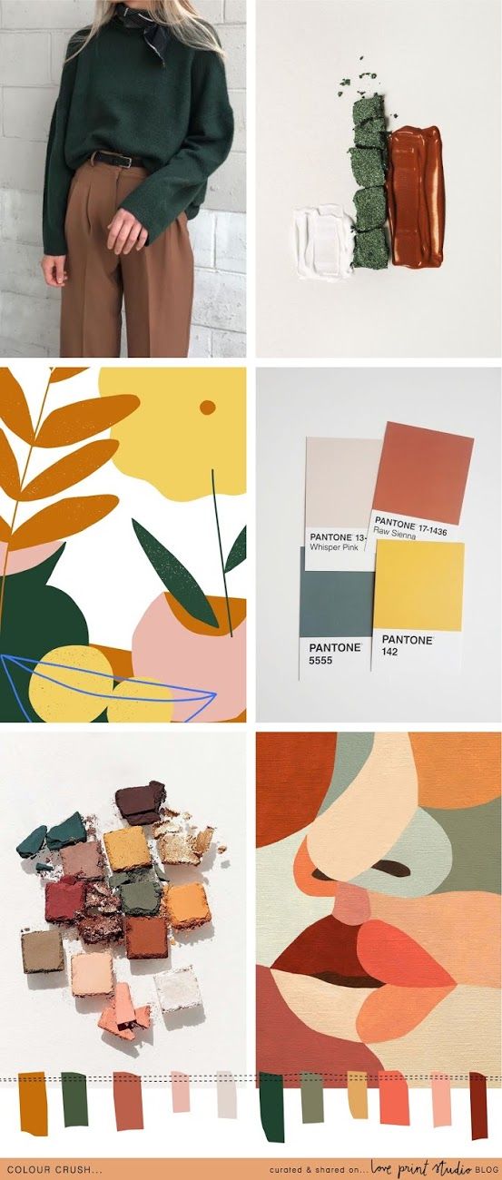
Colour Crush from Love Print Studio Blog
I fell in love with this terra cotta, coral, clay, forest green, and golden palette and knew that Art Gallery Fabrics carried so many Pure Solids in these ranges that coming up with a palette based on this Love Print Studio mood board would be a snap!

The morning of my fabric pull I was walking the dog and marveling at the blue sky when it dawned on me that an ombré background would be an awesome addition to this already earthy, southwestern-looking color palette—was I right???!!! My top is all pieced and am waiting for some Hobbs Poly-Down batting to arrive so I can quilt it. I’ve decide to use my Art Gallery Fabrics Destination Aerial print from my Tapestry collection as the backing and it could be any more perfect!

As promised, I want to share the fabric selection information with you. Now, be warned that doing an ombré background you’ll need to double the amount of background fabric for this quilt because of the size and odd shapes of the pieces create a lot of waste and left over fabrics. I used six gradient fabrics for horizontal rows of color with the two middle blues being used in two horizontal rows. Altogether you’ll need 25 colors (or 27 if each background row is a different gradient) to make a Hold Tight quilt with an ombré background. The rest of the yardage is unchanged.
Cutting Templates and Fabrics
The Hold Tight PDF pattern comes with the full-size templates which already include the seam allowances. Be sure when printing out your PDF pattern that you set you printer to 100%, no scale. Select a US letter paper size and deselect any borderless option (no borderless). Each template page has a 1” square reference square to check for printing scale accuracy. It’s extremely important you print the templates to true size.

With a permanent marking tool, trace the shapes onto heavy template plastic. I highly recommend Dritz Heavy Duty Template Plastic. Transfer shape letter information, grain line arrow. When tracing the Block Trimming Template, include the seam allowance and curves onto your template. Cut templates out with household scissors. Learn more about creating templates from the Hold Tight Sew Along Week #2 video found on my Sew Along page.

Refer to the PDF pattern for strip cutting information and number of pieces to cut. Let template straight edges and grain line marks help you to align the templates onto the fabrics for cutting. A 28 mm rotary cutter is highly suggested for cutting around curves. Use the extra guides of rotary cutter rulers when working on straight edges.
Tip: To help hold the template in place while cutting, roll Washi tape onto itself to make double-sided tape. Adhere the rolled tape onto the back of a template shape in 2-4 places. Fabric can be rotated for cutting ease without disturbing the template position and the taped template can be reused several times before the tape looses it stickiness.

When cutting the B shape pieces, utilize the straight edge of the strip to cut the first shape then rotate the template to make the second cut which leaves an oval shaped scrap. For more demonstrations on cutting see Week #2 video.
Unfortunately, curved patchwork comes with waste pieces. If you plan to do additional curved sewing like trying your had at my free Orange Peel Table Runner these waste pieces can be cut down into smaller sizes and used. Start a bin of castoff curves for that next project.

Stitching, pressing, and squaring up of a finished block will be covered next week and also in Week #3 Sew Along video Part 1 and 2 but I put this image here to show the importance that the template markings play in creating the Block Trimming Template.

A sew along’s a lot more fun with sponsors and giveaways, right!? Our friends at Dritz Sewing, the Fat Quarter Shop, Hobbs Batting, and Omnigrid have generously provided the Hold Tight Sew Along with products I know you’ll love! Every Friday I’ll be posting weekly a giveaway on Instagram. By using the hashtag #HoldTightSewAlong on Instagram every time you post sew along photos to a public account (private account posts don’t show up in hashtag pools) your IG account is automatically entered into the weekly sew along drawings! Ideas for what to share include your sew along progress, the “I’m a maker” sew along badge found HERE, your fabric pull, blocks, and finished quilt. Be sure to follow me on Instagram @sharonhollanddesigns so you never miss a thing!
THIS WEEK'S GIVEAWAY SPONSOR IS from DRITZ Sewing and Omnigrid

This Friday, March 29, 2019 the giveaway prize will be these wonderful Dritz and Omnigrid products:

If you’re wondering why I selected Dritz Shower Curtain Rings to be part of this giveaway package it’s because I love using everyday object in new ways and find this size shower ring to be so handy for keeping template pieces together, organizing swatch cards, note cards, bobbins, keys, etc. Anytime you can organize your work area is a good day, right?
Please note that this giveaway package is for US residence only (sorry, international friends, due to overseas shipping costs I’m asked by our sponsor to keep this giveaway US only.)
Don't forget the giveaways for this sew along are held on Instagram (not on the blog) and winning names are randomly drawn from the posts in the hashtag pool. By posting images of your Hold Tight color inspiration, fabric pull, blocks, or quilt. Use the official #holdtightsewalong hashtag every time you post your makes (to a public account) and you're automatically entered into the weekly IG drawings! See my Instagram Friday giveaway posts @sharonhollanddesigns for full details.